University Project (Industry Project)
Year: 2023
Focus: Branding and cultural storytelling for traditional spirits
University Project (Industry Project)
Year: 2023
Focus: Branding and cultural storytelling for traditional spirits
KOSELI
KOSELI
The Challenge
The Solution
Traditional Nepalese spirits such as Tin Pani Raksi hold strong cultural significance but remain largely inaccessible outside Nepal, particularly in markets like the UK. The challenge was to introduce this lesser-known spirit to a global audience while preserving its cultural authenticity and responding to modern expectations around sustainability, accessibility and choice.
Traditional Nepalese spirits such as Tin Pani Raksi hold strong cultural significance but remain largely inaccessible outside Nepal, particularly in markets like the UK. The challenge was to introduce this lesser-known spirit to a global audience while preserving its cultural authenticity and responding to modern expectations around sustainability, accessibility and choice.
I developed a dynamic discovery system that balances expressive branding with a focused product experience. Vibrant, high-contrast colours help the brand stand out against user-generated video, while a clean, minimalist interface keeps the booking journey intuitive and smooth.
The Solution
KOSELI reimagines Raksi as a contemporary spirits brand, rooted in tradition. The range includes alcoholic, non-alcoholic and fruit-infused variations, allowing the product to appeal to different drinking habits without losing its identity.
The brand works with local family-run producers in Nepal to sustainably source finger millet, ensuring both authenticity and ethical production. Cultural meaning is woven throughout the project, from the name “Koseli”, meaning a gift or token of love, to handcrafted gift pouches produced on traditional handlooms. To support audiences unfamiliar with Raksi, the project also includes a guidebook explaining the distillation process, cultural background and suggested food pairings.
The Challenge
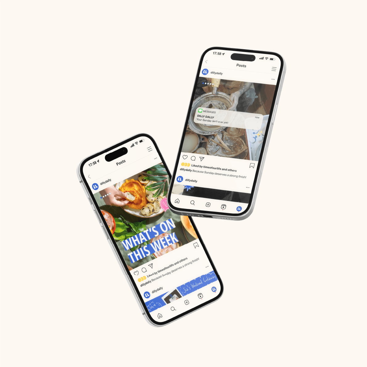
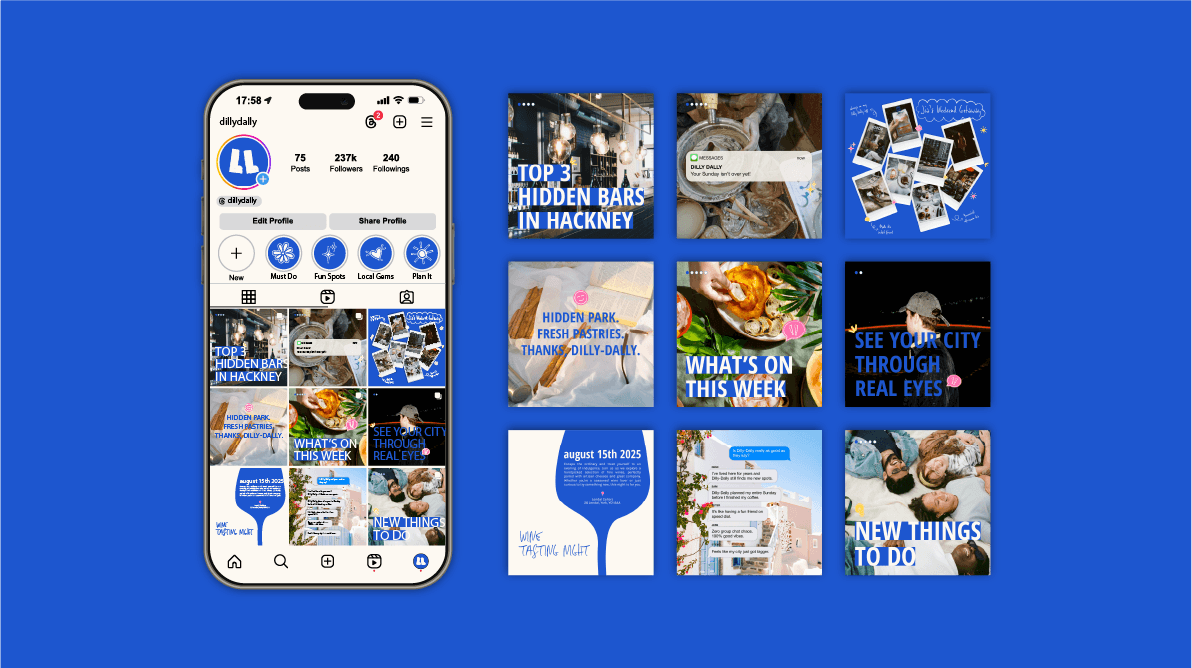
Dilly Dally is a video-first marketplace, often described as TikTok meets Airbnb. The challenge was to create a brand that felt as energetic and exploratory as social media, while maintaining the trust and clarity expected of a booking platform. The identity needed to celebrate aimless wandering while guiding users towards intentional booking.
Visual Identity
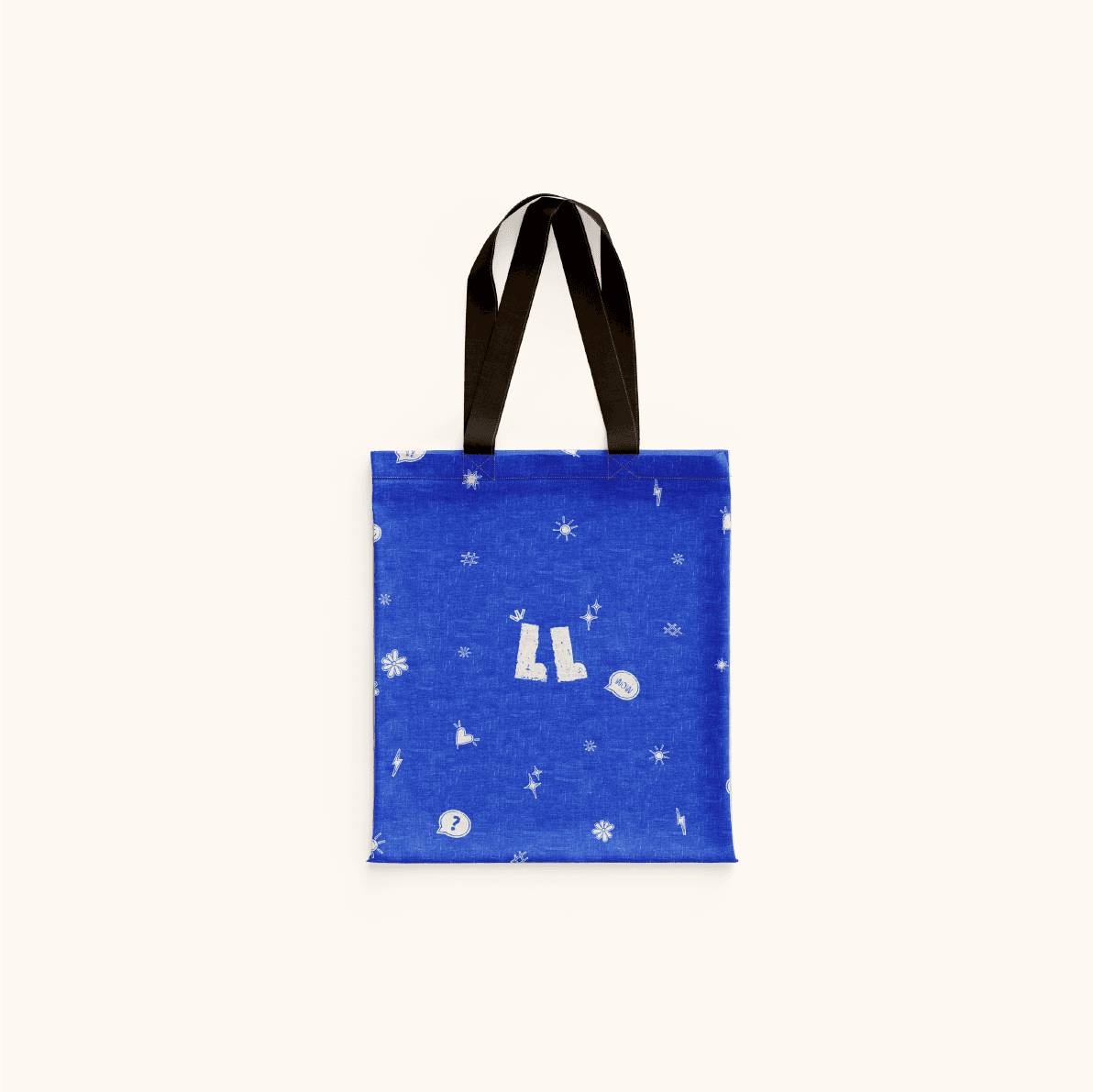
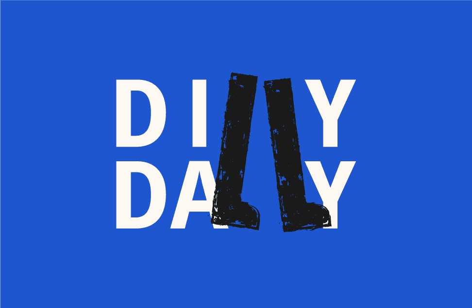
The logo acts as a metaphor for the user journey. Its organic line work represents exploration and gradual discovery, moving from wandering to destination. The flowing paths reference movement through a city, and the absence of rigid angles keeps the mark relaxed and approachable. This reinforces the brand’s aim to make planning feel playful rather than overwhelming.

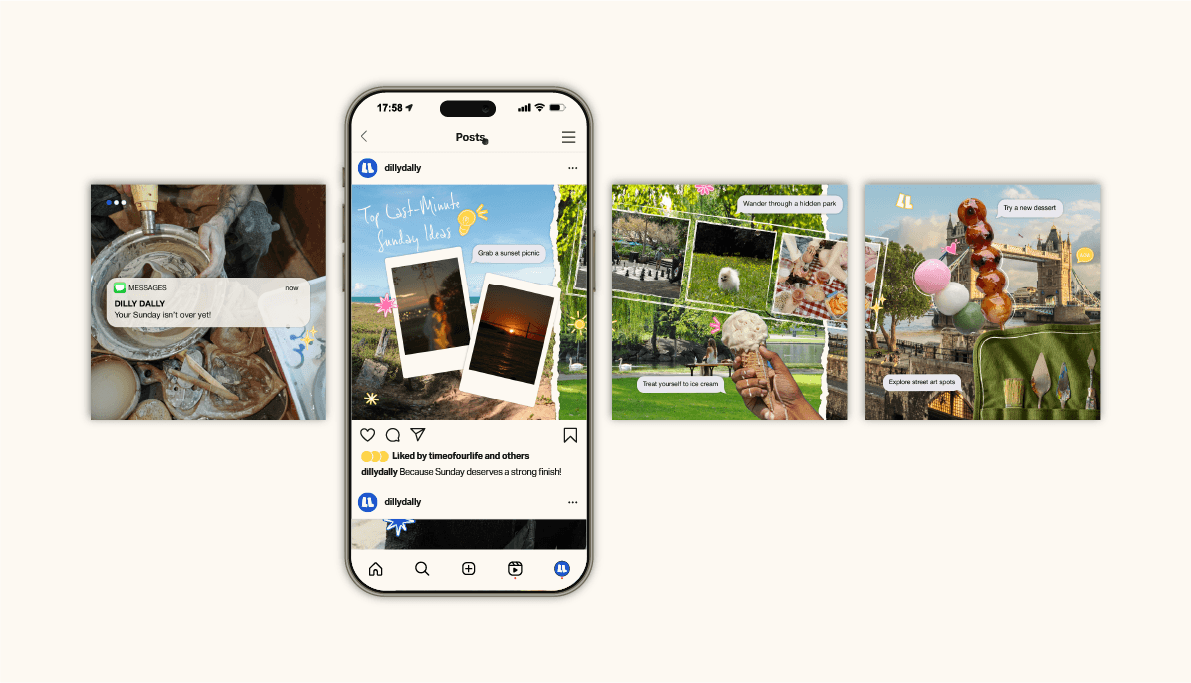
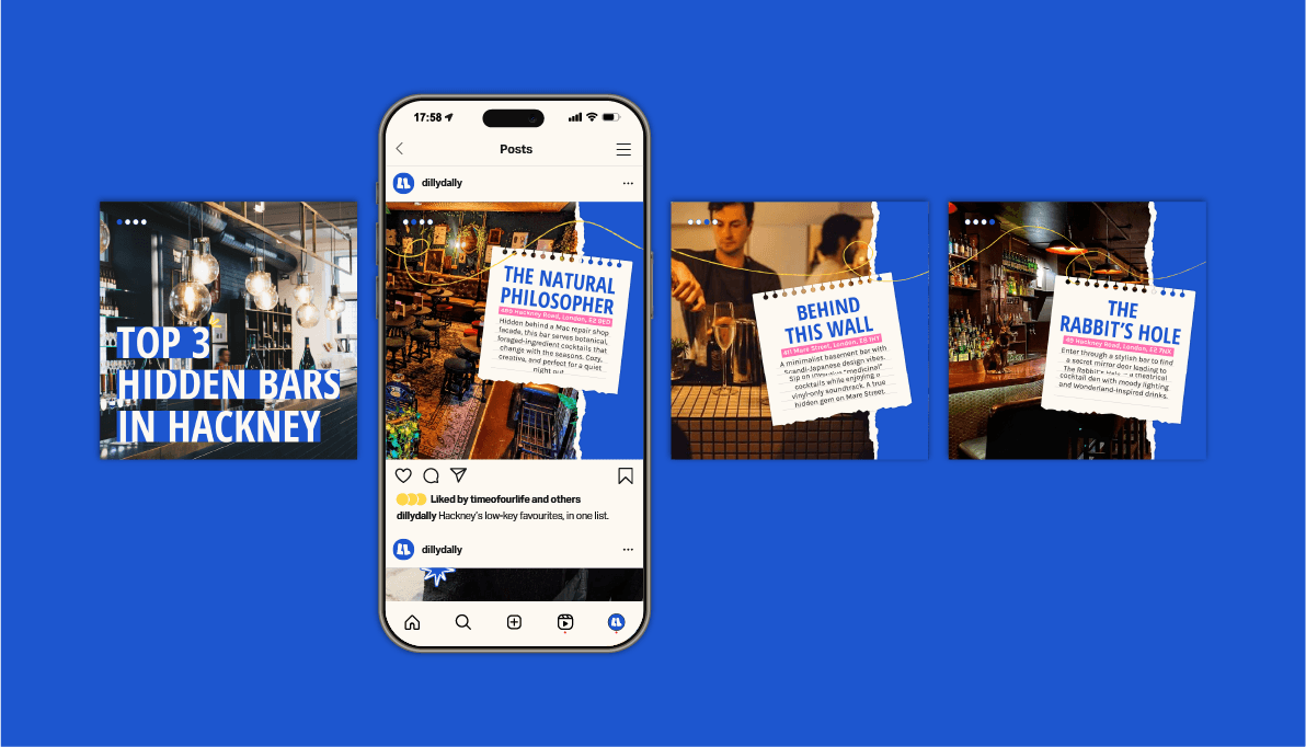
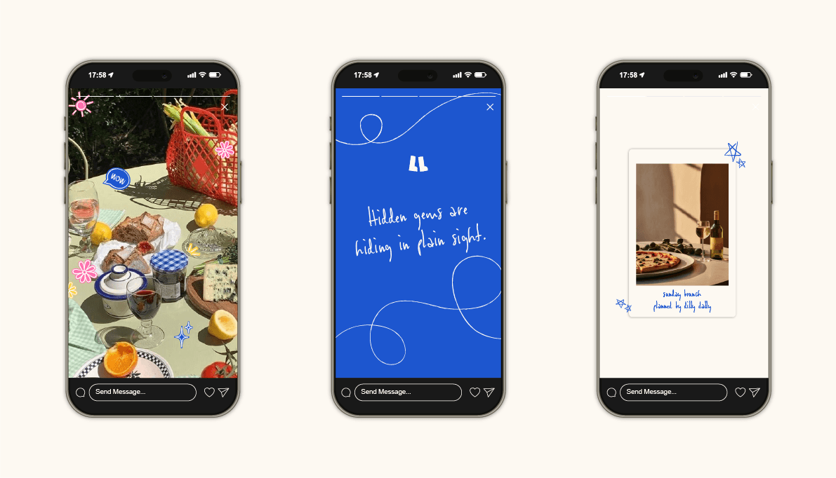
Social Ecosystem
I designed a full social framework to support the brand beyond the app. This included Instagram story templates and creator kits to ensure consistency, recognisability, and flexibility across user-generated and branded content.
Brand Identity
The resulting identity positions Blue Soul as an accessible and ethical footwear brand. Every design decision was made to reinforce the material truth behind the product and clearly communicate that the boots are genuinely made from salvaged plastic.
The resulting identity positions Blue Soul as an accessible and ethical footwear brand. Every design decision was made to reinforce the material truth behind the product and clearly communicate that the boots are genuinely made from salvaged plastic.
Brand Identity
The identity is built around the idea of The Taste of Warmth, reflecting both the physical warmth of the spirit and the emotional warmth of shared moments, community and belonging.
The logo is a fully custom-drawn wordmark, inspired by Nepalese script and designed to balance sharp and soft forms, reflecting the warm yet bold character of the drink. It is supported by Neuzeit Grotesk Bold for headlines and Skolar Sans Latin Light for body copy, keeping the system clear and contemporary.
Designed for Scale
To support growth beyond launch, I created a foundational style guide covering colour, typography, and grid systems. This provides clarity for future design decisions and ensures the brand can scale alongside the product.
Brand Patterns & Bottle Form
Traditional Dhaka hand-woven textile patterns are integrated across labels, packaging and visual assets, reinforcing the brand’s cultural heritage and craftsmanship. The bottle form takes inspiration from traditional distillation vessels, creating a direct visual connection to the product’s origin. A rich, vibrant colour palette draws from tones commonly found in Nepalese festivals and cultural dress.
Traditional Dhaka hand-woven textile patterns are integrated across labels, packaging and visual assets, reinforcing the brand’s cultural heritage and craftsmanship. The bottle form takes inspiration from traditional distillation vessels, creating a direct visual connection to the product’s origin. A rich, vibrant colour palette draws from tones commonly found in Nepalese festivals and cultural dress.
Colour Palette
The colour palette balances the brand’s natural purpose with the reality of recycled materials. Deep blue reflects the ocean and its depth, while contrasting orange introduces urgency and represents the process of recovery and transformation.
The colour palette balances the brand’s natural purpose with the reality of recycled materials. Deep blue reflects the ocean and its depth, while contrasting orange introduces urgency and represents the process of recovery and transformation.
HEX #1d56cf
RGB 29 86 207
CMYK 86 70 0 0
HEX #1d56cf
RGB 29 86 207
CMYK 86 70 0 0
HEX #1d56cf
RGB 29 86 207
CMYK 86 70 0 0
HEX #fdf9f2
RGB 253 249 242
CMYK 0 1 4 0
HEX #fdf9f2
RGB 253 249 242
CMYK 0 1 4 0
HEX #fdf9f2
RGB 253 249 242
CMYK 0 1 4 0
HEX #1A1A1A
RGB 26 26 26
CMYK 73 67 65 78
HEX #1A1A1A
RGB 26 26 26
CMYK 73 67 65 78
HEX #1A1A1A
RGB 26 26 26
CMYK 73 67 65 78
HEX #FFD447
RGB 255 212 71
CMYK 0 15 83 0
HEX #FFD447
RGB 255 212 71
CMYK 0 15 83 0
HEX #FFD447
RGB 255 212 71
CMYK 0 15 83 0
HEX #FF6FAE
RGB 255 111 174
CMYK 0 72 0 0
HEX #FF6FAE
RGB 255 111 174
CMYK 0 72 0 0
HEX #FF6FAE
RGB 255 111 174
CMYK 0 72 0 0
Heading Font
Heading Font
Heading Font
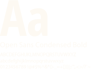
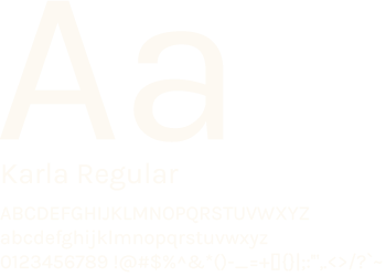
Body font
Body font
Body font
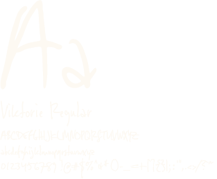
Special font
Special font
Special font
Outcome
Blue Soul demonstrates how brand storytelling and visual identity can be used to build trust in sustainable products. The project explores how emotional narrative, material honesty, and accessible positioning can work together to create a brand that feels both responsible and relatable.
Blue Soul demonstrates how brand storytelling and visual identity can be used to build trust in sustainable products. The project explores how emotional narrative, material honesty, and accessible positioning can work together to create a brand that feels both responsible and relatable.