Case Study
App Design
UI/UX
Dilly Dally: Closing the Gap Between
Discovery and Booking
Dilly Dally: Closing the Gap Between Discovery and Booking
Designing a mobile app that turns short-form video into seamless local discovery and booking.
Designing a mobile app that turns short-form video into seamless local discovery and booking.


Project Type
Freelance
Freelance
Team
Myself
Natalia (Developer)
Jia (Founder)
Myself
Natalia (Developer)
Jia (Founder)
My role
User research
Wireframing
Prototyping
Usability Testing
Brand design
User research
Wireframing
Prototyping
Usability Testing
Brand design
Tools
Figma
Illustrator
Framer
Figma
Illustrator
Framer
Duration
August 2025 – June 2026 (Part-time)
August 2025 – June 2026 (Part-time)
In Short
The 15-Second Version
The 15-Second Version
Dilly Dally is a video-first app designed to help people discover and book local activities without leaving the app, bridging that familiar gap between “I saw this on TikTok” and actually making a plan.
I joined as a brand designer but quickly stepped into a UX leadership role. I ran user interviews and a competitive audit to understand the landscape, then tested two different feed concepts side by side, with a TikTok-style experience coming out on top. Along the way, I identified a key discoverability issue that caused half of testers to miss important activity details and worked through solutions to fix it.
The final experience tested strongly. 80% of users rated it 4–5 out of 5 and said they would use the app. Midway through the project, the founder shifted the business model from in-app booking to an external flow, so I adapted the user journey and refined the MVP scope to align with that change.
Dilly Dally is a video-first app designed to help people discover and book local activities without leaving the app, bridging that familiar gap between “I saw this on TikTok” and actually making a plan.
I joined as a brand designer but quickly stepped into a UX leadership role. I ran user interviews and a competitive audit to understand the landscape, then tested two different feed concepts side by side, with a TikTok-style experience coming out on top. Along the way, I identified a key discoverability issue that caused half of testers to miss important activity details and worked through solutions to fix it.
The final experience tested strongly. 80% of users rated it 4–5 out of 5 and said they would use the app. Midway through the project, the founder shifted the business model from in-app booking to an external flow, so I adapted the user journey and refined the MVP scope to align with that change.
Overview
People discover on video, but still have to leave the app to book
People discover on video, but still have to leave the app to book
Finding something to do in a city often starts with a lot of searching. People use a mix of TikTok, Instagram, Google, and event platforms to discover places and experiences, but the process can become fragmented. Ideas get saved across different apps, details are easy to lose, and there is often a gap between finding something interesting and actually making a plan.
Dilly Dally is a video-first discovery app designed to help users find and book restaurants, activities, and local experiences in their city. It combines the inspiration of short-form video with the ability to take action, helping users move from discovering an idea to planning an experience.
I joined the project as a Brand & UX/UI Designer, working across research, ideation, prototyping, and product direction. My role was to help understand user behaviour, define the experience, and shape how users move through the journey from discovery to booking.
Finding something to do in a city often starts with a lot of searching. People use a mix of TikTok, Instagram, Google, and event platforms to discover places and experiences, but the process can become fragmented. Ideas get saved across different apps, details are easy to lose, and there is often a gap between finding something interesting and actually making a plan.
Dilly Dally is a video-first discovery app designed to help users find and book restaurants, activities, and local experiences in their city. It combines the inspiration of short-form video with the ability to take action, helping users move from discovering an idea to planning an experience.
I joined the project as a Brand & UX/UI Designer, working across research, ideation, prototyping, and product direction. My role was to help understand user behaviour, define the experience, and shape how users move through the journey from discovery to booking.
Overview
Hired for branding, I stepped up to take on UX too
Hired for branding, I stepped up to take on UX too
I was initially brought onto Dilly Dally to build the brand identity. After completing that work, I was asked to take on the UX/UI side of the project as well. My early focus was on discovery workshops, journey mapping, and creating the foundation for prototyping and testing.
I was initially brought onto Dilly Dally to build the brand identity. After completing that work, I was asked to take on the UX/UI side of the project as well. My early focus was on discovery workshops, journey mapping, and creating the foundation for prototyping and testing.
We started with a team workshop that combined two activities:
Problem and solution mapping helped capture different perspectives, surface assumptions, and identify potential user problems.
As-is and to-be journey mapping helped compare the current experience with the experience we wanted to create.
The workshop helped identify seven user pain points, which were narrowed down into three key priorities. It also led to an early decision to focus on improving the feed experience first, as this was where users would discover and engage with content.
Rather than assuming which features would create value, we planned multiple prototype variations, testing some with specific features and others without, to understand their actual impact.
Our developer also introduced lightweight validation methods, including Figma and Google Forms testing, story mapping, and opportunity assessment. This shifted the team's thinking around risk: it was not only about whether something was usable, but also whether it was feasible to build, valuable to users, and responsible to introduce.
This approach shaped how I worked throughout the project. The biggest takeaway was that UX starts before screens are designed. Understanding whether a problem is worth solving is just as important as making sure the final solution is easy to use.
We started with a team workshop that combined two activities:
Problem and solution mapping helped capture different perspectives, surface assumptions, and identify potential user problems.
As-is and to-be journey mapping helped compare the current experience with the experience we wanted to create.
The workshop helped identify seven user pain points, which were narrowed down into three key priorities. It also led to an early decision to focus on improving the feed experience first, as this was where users would discover and engage with content.
Rather than assuming which features would create value, we planned multiple prototype variations, testing some with specific features and others without, to understand their actual impact.
Our developer also introduced lightweight validation methods, including Figma and Google Forms testing, story mapping, and opportunity assessment. This shifted the team's thinking around risk: it was not only about whether something was usable, but also whether it was feasible to build, valuable to users, and responsible to introduce.
This approach shaped how I worked throughout the project. The biggest takeaway was that UX starts before screens are designed. Understanding whether a problem is worth solving is just as important as making sure the final solution is easy to use.
The Why
The problem wasn't finding ideas — it was trusting and acting on them
The problem wasn't finding ideas — it was trusting and acting on them
Turning inspiration into action
Users did not struggle to find inspiration. The bigger challenge was turning that inspiration into something they could act on.
Discovering things to do in a city is often fragmented and time-consuming. People move between TikTok, Instagram, Google, and event platforms to find ideas, but this often leaves them with scattered information, too many options, and uncertainty around what is actually worth doing.
Early interviews highlighted three recurring challenges: trusting what they found, knowing how to book, and navigating multiple steps before making a decision.
Trust was one of the biggest concerns raised during interviews. Participants wanted more confidence that the places they discovered were genuinely worth visiting, especially when relying on reviews and social content.
“Not sure whether the place you found is actually good (unreliable reviews)”
Participants frequently mentioned uncertainty around reviews and whether online recommendations reflected the real experience. This showed that discovery alone was not enough; users needed enough trust to move from interest to action.
Content overload was another issue. Even when people found platforms with relevant options, filtering through the amount of information available still required effort.
“Too often there are too many options. Each site looks completely different from the other and things tend to be either on lists or get lost in too much text.”
“Regarding social videos, it can be challenging to find exactly what I'm looking for as there would usually be lots of results but not all of them are relevant to what I need in the moment.”
Planning with others introduced another layer of friction. Users often needed to coordinate with friends, check availability, and make reservations before committing to an activity.
“Nowadays everything needs reservation. It can be challenging to plan things last minute with friends.”
These findings shaped the product direction: reducing the gap between discovering an experience and making a plan.
Turning inspiration into action
Users did not struggle to find inspiration. The bigger challenge was turning that inspiration into something they could act on.
Discovering things to do in a city is often fragmented and time-consuming. People move between TikTok, Instagram, Google, and event platforms to find ideas, but this often leaves them with scattered information, too many options, and uncertainty around what is actually worth doing.
Early interviews highlighted three recurring challenges: trusting what they found, knowing how to book, and navigating multiple steps before making a decision.
Trust was one of the biggest concerns raised during interviews. Participants wanted more confidence that the places they discovered were genuinely worth visiting, especially when relying on reviews and social content.
“Not sure whether the place you found is actually good (unreliable reviews)”
Participants frequently mentioned uncertainty around reviews and whether online recommendations reflected the real experience. This showed that discovery alone was not enough; users needed enough trust to move from interest to action.
Content overload was another issue. Even when people found platforms with relevant options, filtering through the amount of information available still required effort.
“Too often there are too many options. Each site looks completely different from the other and things tend to be either on lists or get lost in too much text.”
“Regarding social videos, it can be challenging to find exactly what I'm looking for as there would usually be lots of results but not all of them are relevant to what I need in the moment.”
Planning with others introduced another layer of friction. Users often needed to coordinate with friends, check availability, and make reservations before committing to an activity.
“Nowadays everything needs reservation. It can be challenging to plan things last minute with friends.”
These findings shaped the product direction: reducing the gap between discovering an experience and making a plan.
The problem
Inspiration and booking live in separate apps, so plans get lost between the two
Too many options across too many platforms creates decision fatigue, and trust in what's found is low
Planning with friends becomes a back-and-forth of screenshots and messages, so groups default to the same familiar spots
The solution
Combine video-led discovery with instant, in-app booking so there's no gap between "I want to do this" and "it's booked"
Curate content around hidden gems and local experiences, not just what's already trending
Let users share and act on plans within the app, removing the group-chat back-and-forth
Background
Before designing anything, I looked at how people already discover and book things online
Before designing anything, I looked at how people already discover and book things online
I ran a competitive audit across five apps in the discovery, travel, and event booking space (Atmosfy, Werr, Fever, Eventbrite, and Super Reel Travels) to understand what was working, what wasn't, and where Dilly Dally could differentiate.
I ran a competitive audit across five apps in the discovery, travel, and event booking space (Atmosfy, Werr, Fever, Eventbrite, and Super Reel Travels) to understand what was working, what wasn't, and where Dilly Dally could differentiate.

Users consistently preferred video-first platforms over text and photo reviews because video felt more immediate and closer to the real experience. However, even when competitors did discovery well, the booking journey often broke down by sending users elsewhere to complete the next step.
Across competitor research, several recurring issues appeared: inconsistent content quality, unclear pricing, cluttered interfaces, and unreliable performance. No competitor fully connected discovery and booking within a single video-led experience, which highlighted an opportunity for Dilly Dally to reduce the gap between finding an activity and making a decision.
Turning these findings into a SWOT analysis helped identify where the product had potential, as well as the risks to consider early on. The main strengths were the video-first approach and the ambition to connect discovery with action in one flow. The key weaknesses were the limited content library at an early stage and the initial focus on London.
The biggest opportunity was focusing on spontaneous city experiences rather than trying to compete with broader discovery platforms. However, the main risk was that users could treat the app as a source of inspiration without progressing to a booking.
Users consistently preferred video-first platforms over text and photo reviews because video felt more immediate and closer to the real experience. However, even when competitors did discovery well, the booking journey often broke down by sending users elsewhere to complete the next step.
Across competitor research, several recurring issues appeared: inconsistent content quality, unclear pricing, cluttered interfaces, and unreliable performance. No competitor fully connected discovery and booking within a single video-led experience, which highlighted an opportunity for Dilly Dally to reduce the gap between finding an activity and making a decision.
Turning these findings into a SWOT analysis helped identify where the product had potential, as well as the risks to consider early on. The main strengths were the video-first approach and the ambition to connect discovery with action in one flow. The key weaknesses were the limited content library at an early stage and the initial focus on London.
The biggest opportunity was focusing on spontaneous city experiences rather than trying to compete with broader discovery platforms. However, the main risk was that users could treat the app as a source of inspiration without progressing to a booking.

User interviews
I interviewed and surveyed a small group of people who regularly plan social outings in London to learn their sentiment about how they discover and book things to do.
I interviewed and surveyed a small group of people who regularly plan social outings in London to learn their sentiment about how they discover and book things to do.
The goal of the interviews was to understand how people currently discover and book activities, including their motivations, behaviours, and frustrations with existing platforms.
I spoke to people who visit London with friends or family rather than alone, and who actively look for new things to do around once a month.
Interview objectives
Understand where people start their search for activities and which sources they trust most
Identify what motivates people to try somewhere new instead of returning to familiar places
Understand frustrations with current discovery platforms and booking journeys
Explore how people judge whether an online recommendation is worth visiting
Understand how planning with friends or groups influences decisions
Key findings
Activities such as bowling, escape rooms, and darts were the most commonly mentioned interests, followed by restaurants, cafés, and bars. TikTok and word-of-mouth were the most frequently used discovery sources, followed by Google, Instagram, and Reddit.
However, despite regularly using these platforms, participants were only moderately confident in their ability to consistently find things they wanted to do. People were already searching, but the process was not always leading to a clear decision.
Three main frustrations came up repeatedly:
1. Trusting recommendations
Participants wanted more confidence that the places they discovered would match the expectations set online.
“Not sure whether the place you found is actually good (unreliable reviews)”
Uncertainty around reviews and whether recommendations reflected the real experience was a recurring issue when planning activities in London.
2. Too much content, not enough direction
Participants found that existing platforms often created more searching rather than helping them make a decision.
“Too often there are too many options. Each site looks completely different from the other and things tend to be either on lists or get lost in too much text.”
“Regarding social videos, it can be challenging to find exactly what I'm looking for as there would usually be lots of results but not all of them are relevant to what I need in the moment.”
3. Turning an idea into a plan
Planning with other people added another layer of friction. Availability, reservations, and coordinating decisions could make spontaneous plans difficult.
“Nowadays everything needs reservation. It can be challenging to plan things last minute with friends.”
These findings showed that the problem was not a lack of inspiration. People already had plenty of places and activities to discover. The bigger challenge was building enough confidence and reducing enough friction to move from finding something interesting to actually making a plan.
The goal of the interviews was to understand how people currently discover and book activities, including their motivations, behaviours, and frustrations with existing platforms.
I spoke to people who visit London with friends or family rather than alone, and who actively look for new things to do around once a month.
Interview objectives
Understand where people start their search for activities and which sources they trust most
Identify what motivates people to try somewhere new instead of returning to familiar places
Understand frustrations with current discovery platforms and booking journeys
Explore how people judge whether an online recommendation is worth visiting
Understand how planning with friends or groups influences decisions
Key findings
Activities such as bowling, escape rooms, and darts were the most commonly mentioned interests, followed by restaurants, cafés, and bars. TikTok and word-of-mouth were the most frequently used discovery sources, followed by Google, Instagram, and Reddit.
However, despite regularly using these platforms, participants were only moderately confident in their ability to consistently find things they wanted to do. People were already searching, but the process was not always leading to a clear decision.
Three main frustrations came up repeatedly:
1. Trusting recommendations
Participants wanted more confidence that the places they discovered would match the expectations set online.
“Not sure whether the place you found is actually good (unreliable reviews)”
Uncertainty around reviews and whether recommendations reflected the real experience was a recurring issue when planning activities in London.
2. Too much content, not enough direction
Participants found that existing platforms often created more searching rather than helping them make a decision.
“Too often there are too many options. Each site looks completely different from the other and things tend to be either on lists or get lost in too much text.”
“Regarding social videos, it can be challenging to find exactly what I'm looking for as there would usually be lots of results but not all of them are relevant to what I need in the moment.”
3. Turning an idea into a plan
Planning with other people added another layer of friction. Availability, reservations, and coordinating decisions could make spontaneous plans difficult.
“Nowadays everything needs reservation. It can be challenging to plan things last minute with friends.”
These findings showed that the problem was not a lack of inspiration. People already had plenty of places and activities to discover. The bigger challenge was building enough confidence and reducing enough friction to move from finding something interesting to actually making a plan.
Findings & Analysis
People trust video over text — but nothing closes the loop from finding an idea to booking it
People trust video over text — but nothing closes the loop from finding an idea to booking it
Persona
Three personas emerged from the research: Billie, a marketing intern chasing shareable, Instagrammable plans; Ollie, a freelancer wanting to support local businesses without hours of research; and Priya, a senior accountant with little free time who wants everything "sorted" for her.
designed around Priya, the highest-friction case, on the logic that solving for her would also hold up for Billie and Ollie's less time-pressured needs.
"My job is busy and stressful so when I do get free time, I want to make the most of it. I don't want to waste time planning. I would like everything to be sorted for me." — Priya
Persona
Three personas emerged from the research: Billie, a marketing intern chasing shareable, Instagrammable plans; Ollie, a freelancer wanting to support local businesses without hours of research; and Priya, a senior accountant with little free time who wants everything "sorted" for her.
designed around Priya, the highest-friction case, on the logic that solving for her would also hold up for Billie and Ollie's less time-pressured needs.
"My job is busy and stressful so when I do get free time, I want to make the most of it. I don't want to waste time planning. I would like everything to be sorted for me." — Priya

Feature Roadmap
Interview findings translated directly into product priorities. The biggest needs were building trust in recommendations, reducing friction in the booking journey, and making key information such as price, location, and timing easy to access.
These became the highest priorities for the first version of the product. Features such as niche filtering and saving activities supported the discovery experience, while AI-assisted itinerary planning and group planning tools were treated as later opportunities to explore and validate rather than essential MVP features.
Feature Roadmap
Interview findings translated directly into product priorities. The biggest needs were building trust in recommendations, reducing friction in the booking journey, and making key information such as price, location, and timing easy to access.
These became the highest priorities for the first version of the product. Features such as niche filtering and saving activities supported the discovery experience, while AI-assisted itinerary planning and group planning tools were treated as later opportunities to explore and validate rather than essential MVP features.
Ideation & Design
Turning workshop post-its into a structure people could actually move through
Turning workshop post-its into a structure people could actually move through
Site Map
With priorities set, I mapped the full information architecture across five top-level areas, built directly from the workshop's post-its: Discover, the core loop this project is built around; Be in the Know, for local spots; Planner, the more ambitious AI-driven branch; Saved; and Profile. Discover takes a user from the feed into an activity's details, then into booking, saving, or checking its location and reviews — with save, add-to-itinerary, and share surfaced at each step rather than buried behind a single action. Planner is an AI chat/questionnaire that asks about budget, interests, timing, and guests to generate an editable itinerary, plus group trip collaboration for inviting friends, voting on activities, and splitting payment
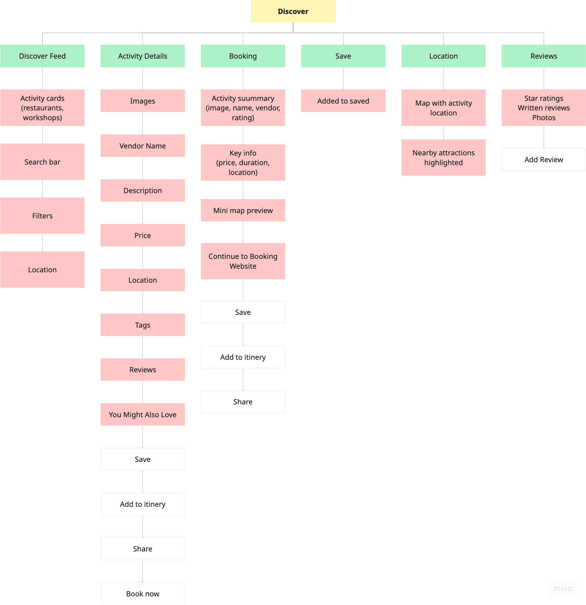
With priorities defined, I mapped the information architecture based on the themes and pain points identified during the workshop.
The structure was built around five key areas:
Discover: the core experience and main user journey, taking users from finding an activity to making a decision
Be in the Know: a space for discovering local recommendations and updates
Planner: an AI-assisted planning experience for creating more detailed itineraries
Saved: a place to revisit activities users had bookmarked
Profile: managing personal details and preferences
With priorities defined, I mapped the information architecture based on the themes and pain points identified during the workshop.
The structure was built around five key areas:
Discover: the core experience and main user journey, taking users from finding an activity to making a decision
Be in the Know: a space for discovering local recommendations and updates
Planner: an AI-assisted planning experience for creating more detailed itineraries
Saved: a place to revisit activities users had bookmarked
Profile: managing personal details and preferences

Onboarding
Onboarding

Discovery Feed
Discovery Feed

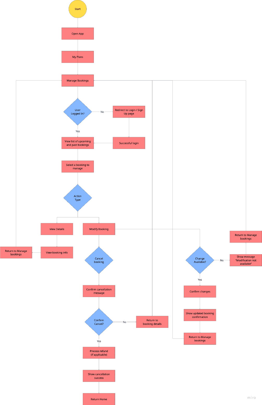
Booking & Manage Booking
Booking & Manage Booking
Low & Mid Fidelity Wireframing
I started with the Explore feed, since research had flagged it as the highest priority - sketching a full-screen video-scroll layout against a more traditional card-based layout at low fidelity, to catch structural problems before investing in visual design. At mid-fidelity, I built both directions out properly enough to test, so the choice between them could come from how people actually used them, not just how they looked.
Low & Mid Fidelity Wireframing
I started with the Explore feed, since research had flagged it as the highest priority - sketching a full-screen video-scroll layout against a more traditional card-based layout at low fidelity, to catch structural problems before investing in visual design. At mid-fidelity, I built both directions out properly enough to test, so the choice between them could come from how people actually used them, not just how they looked.
Version A
Scrolling feed
Version A
Scrolling feed

Version B
Swiping feed
Version B
Swiping feed

Usability Test: Explore Feed
Version A won decisively — testers preferred the familiar, full-screen TikTok-style feed
Version A won decisively — testers preferred the familiar, full-screen TikTok-style feed
I tested two Explore feed directions at high fidelity with seven participants across desktop and iOS/Android. Version A used a full-screen vertical scroll pattern, similar to TikTok and Reels, while Version B explored a more traditional card-based interaction.
Version A performed better overall. While some testers preferred aspects of Version B’s swipe mechanics, most found Version A more familiar and easier to engage with. Design was rated 4.29/5, flow 4.67/5, and ease of discovery 4.43/5.
One participant highlighted the value of familiarity:
“I liked how familiar it felt. I use TikTok and Reels all the time, so I liked the comfort of that instead of the daunting feeling of a new interface.”
The main usability issue identified was scroll snapping. In some cases, the feed stopped between two activities rather than clearly landing on one, which made the experience feel less controlled.
With the feed direction validated, I moved on to designing the Activity Info page and Account screens to complete the journey from discovery through to booking.
I tested two Explore feed directions at high fidelity with seven participants across desktop and iOS/Android. Version A used a full-screen vertical scroll pattern, similar to TikTok and Reels, while Version B explored a more traditional card-based interaction.
Version A performed better overall. While some testers preferred aspects of Version B’s swipe mechanics, most found Version A more familiar and easier to engage with. Design was rated 4.29/5, flow 4.67/5, and ease of discovery 4.43/5.
One participant highlighted the value of familiarity:
“I liked how familiar it felt. I use TikTok and Reels all the time, so I liked the comfort of that instead of the daunting feeling of a new interface.”
The main usability issue identified was scroll snapping. In some cases, the feed stopped between two activities rather than clearly landing on one, which made the experience feel less controlled.
With the feed direction validated, I moved on to designing the Activity Info page and Account screens to complete the journey from discovery through to booking.
Explore Feed
Full-screen, snap-scrolling cards surface rating, name, location, date, and starting price up front, so nothing critical is hidden behind a tap.
Explore Feed
Full-screen, snap-scrolling cards surface rating, name, location, date, and starting price up front, so nothing critical is hidden behind a tap.

Activity Info
Tapping an activity's name opens a dedicated page — map, hours, verified rating and review count, a photo gallery, a "Things to Do" list, and related recommendations, ending in a persistent Book Now.
Activity Info
Tapping an activity's name opens a dedicated page — map, hours, verified rating and review count, a photo gallery, a "Things to Do" list, and related recommendations, ending in a persistent Book Now.

Booking
A streamlined flow gets a user from decision to confirmed booking in a couple of taps, without leaving the app.
Booking
A streamlined flow gets a user from decision to confirmed booking in a couple of taps, without leaving the app.

Usability Test
Saving worked immediately; finding activity detail didn't, so I fixed the detail flow specifically
Saving worked immediately; finding activity detail didn't, so I fixed the detail flow specifically
I ran moderated, task-based sessions where participants were asked to save an activity and find it again later, then explore more details about an activity. Sessions used think-aloud testing followed by a satisfaction survey.
Saving an activity was a clear success. All participants completed the task, rating how obvious the action felt between 9 and 10 out of 10. Overall satisfaction for this task was 4.29/5.
Finding activity details revealed the main usability issue. Only half of participants completed the task successfully, as the info icon and an unclear swipe interaction were not discovered. Satisfaction dropped to 3.57/5, making this the weakest part of the experience.
Reviewing the design, I realised the feed was already competing for attention. It included labelled actions for Save, Review, and Share, hashtag tags, review counts, ratings, price information, and a separate “Book Now” button. With so many elements visible at once, an unlabeled icon was easy to miss.
The challenge was finding a way to surface important trust information, such as reviews, pricing, and location, without adding more clutter or taking away from the full-screen experience that tested well. This led to the decision to move key information into a dedicated Activity Detail page rather than adding more elements to the feed.
I ran moderated, task-based sessions where participants were asked to save an activity and find it again later, then explore more details about an activity. Sessions used think-aloud testing followed by a satisfaction survey.
Saving an activity was a clear success. All participants completed the task, rating how obvious the action felt between 9 and 10 out of 10. Overall satisfaction for this task was 4.29/5.
Finding activity details revealed the main usability issue. Only half of participants completed the task successfully, as the info icon and an unclear swipe interaction were not discovered. Satisfaction dropped to 3.57/5, making this the weakest part of the experience.
Reviewing the design, I realised the feed was already competing for attention. It included labelled actions for Save, Review, and Share, hashtag tags, review counts, ratings, price information, and a separate “Book Now” button. With so many elements visible at once, an unlabeled icon was easy to miss.
The challenge was finding a way to surface important trust information, such as reviews, pricing, and location, without adding more clutter or taking away from the full-screen experience that tested well. This led to the decision to move key information into a dedicated Activity Detail page rather than adding more elements to the feed.
Low Fidelity Wireframing
Low Fidelity Wireframing
Feed
Feed

Information
Information

Account
Account

Nav Bar
Nav Bar

Mid Fidelity Wireframing
Mid Fidelity Wireframing


Below is the solution I landed on, and how I addressed the rest of the feedback.
Below is the solution I landed on, and how I addressed the rest of the feedback.
I decluttered the feed
The labeled Save/Review/Share icons became icon-only, hashtag tags became a real one-line description, the review count moved off the card, and the separate "Book Now" button was dropped in favor of just showing the starting price. Less competing for attention meant the path to more detail had room to actually register.
I decluttered the feed
The labeled Save/Review/Share icons became icon-only, hashtag tags became a real one-line description, the review count moved off the card, and the separate "Book Now" button was dropped in favor of just showing the starting price. Less competing for attention meant the path to more detail had room to actually register.
Before
Before

After
After
I swapped the filter icon for something unambiguous.
Testers kept mistaking the original hamburger menu for a navigation drawer, so I replaced it with a funnel icon - a more immediately legible signal for "filter."
I swapped the filter icon for something unambiguous.
Testers kept mistaking the original hamburger menu for a navigation drawer, so I replaced it with a funnel icon - a more immediately legible signal for "filter."
Before
Before

After
After

I gave activity detail its own dedicated page
I moved the core trust signals (rating, name, description, location, price) onto the feed card itself, and made the activity name the entry point to a full info page: map, hours, verified rating and review count, a photo gallery, a "Things to Do" list, and related recommendations, ending in a persistent Book Now. This solved the discoverability problem outright rather than patching the original gesture.
I gave activity detail its own dedicated page
I moved the core trust signals (rating, name, description, location, price) onto the feed card itself, and made the activity name the entry point to a full info page: map, hours, verified rating and review count, a photo gallery, a "Things to Do" list, and related recommendations, ending in a persistent Book Now. This solved the discoverability problem outright rather than patching the original gesture.

In-Person Testing Revealed a Strong Preference for Real, Unfiltered Content
All three participants I interviewed 1:1 currently piece together plans using a mix of Google, Reddit, and TikTok. They consistently valued content that felt real and unfiltered, such as Reddit’s mixed opinions or TikTok videos showing the actual experience, over more polished or curated content.
One participant said he avoided platforms where he suspected reviews were generated or unreliable, while another said seeing a real video made her more likely to book than reading a written review. These insights influenced how content and reviews are handled across the product: prioritising creator-led content, limiting reviews to users who have completed a booking, using checks to identify misleading content, and moderating harmful behaviour rather than removing negative opinions.
In-Person Testing Revealed a Strong Preference for Real, Unfiltered Content
All three participants I interviewed 1:1 currently piece together plans using a mix of Google, Reddit, and TikTok. They consistently valued content that felt real and unfiltered, such as Reddit’s mixed opinions or TikTok videos showing the actual experience, over more polished or curated content.
One participant said he avoided platforms where he suspected reviews were generated or unreliable, while another said seeing a real video made her more likely to book than reading a written review. These insights influenced how content and reviews are handled across the product: prioritising creator-led content, limiting reviews to users who have completed a booking, using checks to identify misleading content, and moderating harmful behaviour rather than removing negative opinions.
Results
Users saved easily, trusted the flow, and said they'd use it
Users saved easily, trusted the flow, and said they'd use it
All metrics came from the same testing round described earlier. The numbers were mainly used to check whether the core idea held up in practice. Overall, they indicate that the concept works as intended: helping users move from discovering something to making a plan, without losing that intent.
Saving an activity, the first step of “find it, keep it”, was completed by all participants without difficulty. Each tester rated this task between 9 and 10 out of 10. This aligns with a point raised in earlier interviews, where participants described saving places across multiple apps and often losing track of them. Keeping everything in one place addressed that issue.
Most testers said they would use the app when exploring a city. 80% rated the overall experience 4 or 5 out of 5, with most selecting 5. This suggests the concept fits into how people already plan activities, rather than requiring a new behaviour.
The main usability issue was finding activity details. Testing showed this was due to how information was presented, not a problem with the concept itself. The adjustment was to make key details easier to access through a dedicated page.
All metrics came from the same testing round described earlier. The numbers were mainly used to check whether the core idea held up in practice. Overall, they indicate that the concept works as intended: helping users move from discovering something to making a plan, without losing that intent.
Saving an activity, the first step of “find it, keep it”, was completed by all participants without difficulty. Each tester rated this task between 9 and 10 out of 10. This aligns with a point raised in earlier interviews, where participants described saving places across multiple apps and often losing track of them. Keeping everything in one place addressed that issue.
Most testers said they would use the app when exploring a city. 80% rated the overall experience 4 or 5 out of 5, with most selecting 5. This suggests the concept fits into how people already plan activities, rather than requiring a new behaviour.
The main usability issue was finding activity details. Testing showed this was due to how information was presented, not a problem with the concept itself. The adjustment was to make key details easier to access through a dedicated page.
A Change in Direction
Midway through, the business priority shifted from booking to building an audience
Midway through, the business priority shifted from booking to building an audience
Up to that point, the research had been consistent. Users wanted a simple, seamless flow from discovering an activity to completing a booking. The initial concept and testing focused on validating that this end-to-end loop could work.
Midway through, the founder decided to change the sequencing. Instead of building the full booking experience first, the focus moved to growing awareness and trust through creator and user-generated content. The longer-term goal became turning Dilly Dally into a platform where creators promote local spots and users discover them through that content.
My initial reaction was mixed. The core idea of Dilly Dally had been about closing the gap between finding something and booking it in one place. Moving booking outside the app felt like it went against what we had already validated. The research kept pointing to the same need. People did not want another handoff to a vendor’s site. They wanted the loop to feel complete.
It started to make more sense when I saw it as a sequencing decision rather than a full change in direction. Building booking infrastructure across multiple vendors is complex, expensive, and slow. Building an audience and earning trust through content is much faster to test and iterate on. The thinking was that Dilly Dally first needed to prove people would engage with the content and trust the recommendations before investing in booking at scale.
In practice, this means the “Book Now” call to action directs users to the vendor’s own booking page instead of completing the transaction in the app. The core discovery experience remains the same. Users can browse, build confidence through content, and find relevant activities. The only change is where the booking happens, at least for now.
For an early-stage product, this felt like the right choice. It lets Dilly Dally focus on building an audience and trust first, before taking on the harder work of booking infrastructure. It also taught me that what is best for the user is not always what is best for the business at that stage. The MVP below reflects this narrower scope.
Up to that point, the research had been consistent. Users wanted a simple, seamless flow from discovering an activity to completing a booking. The initial concept and testing focused on validating that this end-to-end loop could work.
Midway through, the founder decided to change the sequencing. Instead of building the full booking experience first, the focus moved to growing awareness and trust through creator and user-generated content. The longer-term goal became turning Dilly Dally into a platform where creators promote local spots and users discover them through that content.
My initial reaction was mixed. The core idea of Dilly Dally had been about closing the gap between finding something and booking it in one place. Moving booking outside the app felt like it went against what we had already validated. The research kept pointing to the same need. People did not want another handoff to a vendor’s site. They wanted the loop to feel complete.
It started to make more sense when I saw it as a sequencing decision rather than a full change in direction. Building booking infrastructure across multiple vendors is complex, expensive, and slow. Building an audience and earning trust through content is much faster to test and iterate on. The thinking was that Dilly Dally first needed to prove people would engage with the content and trust the recommendations before investing in booking at scale.
In practice, this means the “Book Now” call to action directs users to the vendor’s own booking page instead of completing the transaction in the app. The core discovery experience remains the same. Users can browse, build confidence through content, and find relevant activities. The only change is where the booking happens, at least for now.
For an early-stage product, this felt like the right choice. It lets Dilly Dally focus on building an audience and trust first, before taking on the harder work of booking infrastructure. It also taught me that what is best for the user is not always what is best for the business at that stage. The MVP below reflects this narrower scope.
MVP
Scoped down to only what was needed to prove the loop works
Scoped down to only what was needed to prove the loop works
The MVP focused on five key areas: sign-in, the Explore feed, Activity Info page, Account, and an AI-assisted itinerary creator.
Although AI itinerary planning ranked as a lower priority among the wider user group, it directly addressed Priya’s main pain point. Since the product was designed around solving the needs of the highest-friction persona first, the feature was included in the MVP to test whether it could reduce the effort involved in planning.
The MVP focused on five key areas: sign-in, the Explore feed, Activity Info page, Account, and an AI-assisted itinerary creator.
Although AI itinerary planning ranked as a lower priority among the wider user group, it directly addressed Priya’s main pain point. Since the product was designed around solving the needs of the highest-friction persona first, the feature was included in the MVP to test whether it could reduce the effort involved in planning.
Sign In
Sign In

Feed
Feed
Information
Information
Account
Account

AI Itinerary Booking
An AI day plan, bookable in two taps.. It bundles activity, food, and an experience into one AI-suggested day plan, bookable in a couple of taps, similar to booking a stay on Airbnb. It answers Priya's core ask directly: remove the planning, not just the searching.
AI Itinerary Booking
An AI day plan, bookable in two taps.. It bundles activity, food, and an experience into one AI-suggested day plan, bookable in a couple of taps, similar to booking a stay on Airbnb. It answers Priya's core ask directly: remove the planning, not just the searching.


Next Steps
My time on Dilly Dally has ended, but the project continues
My time on Dilly Dally has ended, but the project continues
My freelance work on Dilly Dally has come to an end, but the product is still moving forward. I took the project from early research and wireframes through prototyping, usability testing, brand design, and MVP scope. The team is now continuing the design system and further testing before moving into development with Natalia.
My freelance work on Dilly Dally has come to an end, but the product is still moving forward. I took the project from early research and wireframes through prototyping, usability testing, brand design, and MVP scope. The team is now continuing the design system and further testing before moving into development with Natalia.
Reflection
What I'm Taking With Me
What I'm Taking With Me
This was my first full UX project, so much of the process was learned through applying theory to a real product. I used the Google UX Design Certificate as a foundation for methods like workshops, personas, and usability testing, but working with a founder, developer, and changing business priorities meant the most valuable lessons came through iteration and making decisions in context.
A few things I'm taking with me:
Designing for the highest-friction persona first, rather than the easiest one, was the right approach. The decisions made for Priya, such as surfacing trust signals earlier in the feed and giving activity details their own dedicated page, ended up improving the experience for Billie and Ollie too, even though they had not specifically raised those issues during testing. Solving for the hardest case helped uncover problems that other users may not have encountered yet, but could have later.
Validating the problem mattered just as much as testing the solution. The early workshop’s focus on feasibility, value, and ethics alongside usability helped prevent over-designing the AI Planner feature before confirming it addressed a real user need.
The pivot midway through, from in-app booking to directing users to vendor sites, taught me to separate what is ideal for the user experience from what makes sense for the business at a particular stage. My initial reaction was that moving booking outside the app challenged the original premise, but understanding the reasoning behind the decision, building trust and an audience before investing in booking infrastructure, changed how I viewed the trade-off.
Working on a product designed to help people spend less time scrolling and more time experiencing their city was genuinely rewarding. It reinforced that I enjoy designing for real-world behaviour and meaningful interactions, and it is a problem space I would love to continue exploring.
This was my first full UX project, so much of the process was learned through applying theory to a real product. I used the Google UX Design Certificate as a foundation for methods like workshops, personas, and usability testing, but working with a founder, developer, and changing business priorities meant the most valuable lessons came through iteration and making decisions in context.
A few things I'm taking with me:
Designing for the highest-friction persona first, rather than the easiest one, was the right approach. The decisions made for Priya, such as surfacing trust signals earlier in the feed and giving activity details their own dedicated page, ended up improving the experience for Billie and Ollie too, even though they had not specifically raised those issues during testing. Solving for the hardest case helped uncover problems that other users may not have encountered yet, but could have later.
Validating the problem mattered just as much as testing the solution. The early workshop’s focus on feasibility, value, and ethics alongside usability helped prevent over-designing the AI Planner feature before confirming it addressed a real user need.
The pivot midway through, from in-app booking to directing users to vendor sites, taught me to separate what is ideal for the user experience from what makes sense for the business at a particular stage. My initial reaction was that moving booking outside the app challenged the original premise, but understanding the reasoning behind the decision, building trust and an audience before investing in booking infrastructure, changed how I viewed the trade-off.
Working on a product designed to help people spend less time scrolling and more time experiencing their city was genuinely rewarding. It reinforced that I enjoy designing for real-world behaviour and meaningful interactions, and it is a problem space I would love to continue exploring.
