Brand Identity
Social Media Strategy
App Design
UI/UX
Dilly Dally is a video-first marketplace in the hospitality and social commerce space, blending social discovery with travel booking to make planning feel playful and intuitive. The brand was designed to balance the energy of social media with the trust and clarity required of a booking platform, guiding users from exploration to intentional action. The result is a distinctive identity system that supports engagement, conversion, and scalability across both branded and user-generated content.
Year
2025
Client
Dilly Dlly
Industry
Hospitality, Social Commerce
Role
Brand Designer, UI/UX Designer
Brief
Create a video-first travel and accommodation marketplace that blends social media-style discovery with a trusted booking experience, making trip planning feel playful, intuitive, and seamless.
Problem
The challenge was to create a brand that feels energetic and exploratory like social media while still maintaining the trust and clarity expected of a booking platform. The identity needed to support aimless discovery while gently guiding users toward intentional booking. It also had to stand out within a user-generated video environment without disrupting the booking experience.
Exploration
The visual exploration focused on expressing discovery, movement, and guided spontaneity within the app experience.
A flowing curve symbolises the day plan created by the app, weaving through the letters to represent hidden gems across local neighbourhoods. It reflects a smooth and seamless daily itinerary tailored by the app.
The double “L” also acts as a continuous loop and a location pin, symbolising both endless exploration and the app’s role in helping users discover places. The flowing form suggests that navigation through the city is effortless, fluid, and without limits.


Final
Dilly Dally establishes a distinctive yet trustworthy identity within a competitive market. The system balances exploration with clarity, supporting both engagement and conversion while guiding users seamlessly from discovery to booking.
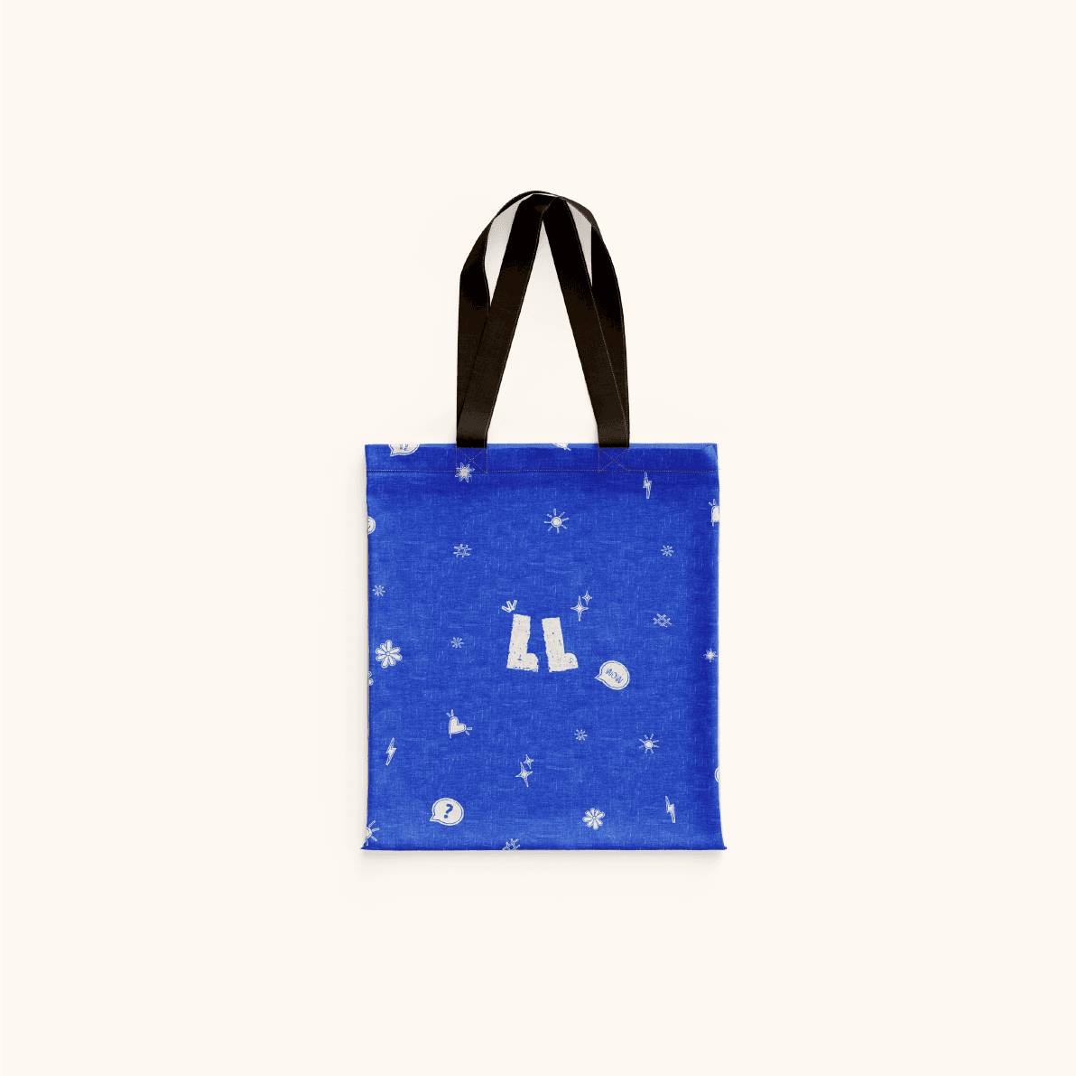
The logo is built around a flowing curve and the double “L”, representing walking on foot and exploring local neighbourhoods. It adds a playful and relatable touch to the brand and also holds potential to evolve into a character or mascot that could guide users through the app and extend into merchandise such as tote bags, pins, notebooks and stickers.
A wider social framework including Instagram templates and creator kits ensures consistency across both branded and user-generated content. This maintains a cohesive voice across social discovery while allowing flexibility for creators to share authentic travel experiences. A foundational style guide further supports scalability, ensuring the system can evolve as the platform grows.
Alongside the brand system, an app prototype is in development focused on refining the user journey and interaction design. The product is being prepared for launch with ongoing iterations shaping how video-led discovery translates into seamless travel booking.